
Message from the awardee
There are many things I want to say – but I prefer to say them through design.
My favorite work of Mr. Kamekura’s is the emblem he created for the 1964 Tokyo Olympics. It’s simple, strong and one-of-a-kind. Seeing it made me want to do work someday that’s simple and “big-boned” like that, work that would leave Japan – leave the entire world – speechless with awe. That’s the kind of design I want to create, I thought, even if only once in my lifetime: work that’s simple, clear and bold. And at some point in time that became my guiding principle of design. Since then I have asked myself, over and over again, the true meaning of design, and what it is that design is capable of. Last year I was presented the occasion to read a bit about Yusaku Kamekura. When I came upon a portrait photo of him, he seemed to be looking at me with a mild hint of anger, as though he were telling me my designs still had a long way to go. It was from then that I set out again on my long journey in design. Not too long ago I looked at his photo again, and this time I had the feeling he was smiling at me ever so slightly. It was shortly after that that I received the phone call telling me, out of the blue, that I had won this award in his name.
Here’s the kind of designer I want to be. A designer who never says he’s too busy to accept a new job. Who never makes excuses. Whose task before him is always connected to the world. Whose designs are both simple and profound. A designer who thinks, then moves his hand; then thinks again, and moves his hand again. A designer who never allows stray thoughts to interfere. A designer who designs by thinking: simply, profoundly, clearly. Who thinks at length, but simply. A designer whose work can sometimes be stressful, but always a delight. The path of design still stretches out far in front of me. I’ll never give up and quit, though, because I’ve got a tortoise on my side*. And though a tortoise may walk slowly, it always gets to where it wants to go.
* Note: The first character in Yusaku Kamekura’s surname means “tortoise.”

Kenjiro Sano
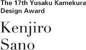
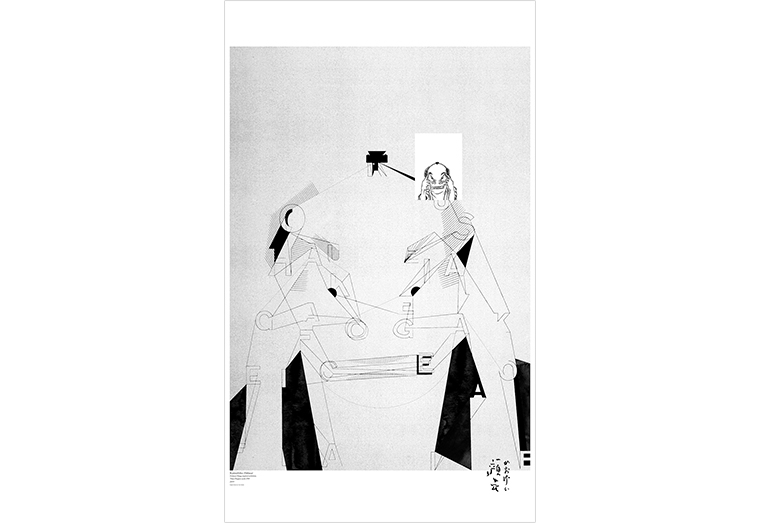
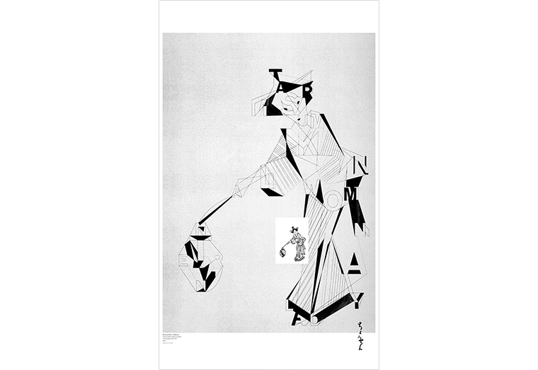
Kenjiro Sano was born in Tokyo in 1972. After graduating from Tama Art University with a degree in Graphic Design, he joined Hakuhodo. Later he established his own company, MR_DESIGN INC. Today Mr Sano also serves as a professor at Tama Art University in the Department of Integrated Design. His major works include: the logomark for the Tokyo International Film Festival; “Southern Alps Natural Mineral Water” and “Green Dakara” for Suntory; “NEXT ONE”, “ReBorn” and “TOYOTOWN” for Toyota; “Nyanmage” for Edo Wonderland; “T Boo! S” for TBS; the commercial film “Stand By Me Doraemon”; “Toromame” for Mizkan; “Tinny & The Balloon” for NHK (educational channel); “Tsuyahime” new rice from Yamagata; “Papyrus” magazine for Gentosha; “LISMO!” for au; etc. Among the awards he has garnered to date are: Mainichi Design Award, New York ADC Gold Award, D&AD Yellow Pencil, Cannes Lions Gold, Tokyo ADC Members Award, Japan Package Design Association Gold Prize, ACC Gold Prize, ACC Talent Award (Green Dakara-chan) and Jun Miura Award (Nyanmage).
(as of January 2015)
Book containing the design: Graphic Design in Japan 2015
